Skip to main content Skip to navigation

Q: How can we ease the pain of losing a loved one?

A: Downfall By Numbers
an interactive data visualization
This project consists of an interactive digital infographic, made with Processing, a programming language.

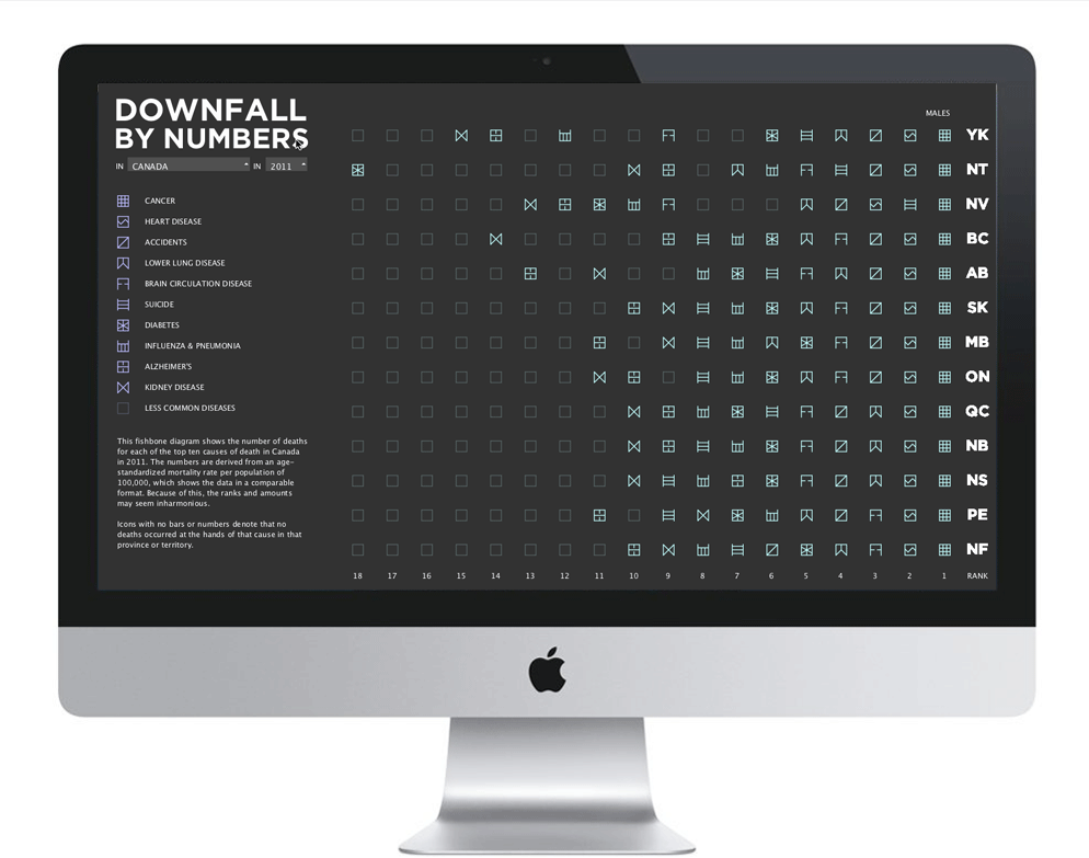
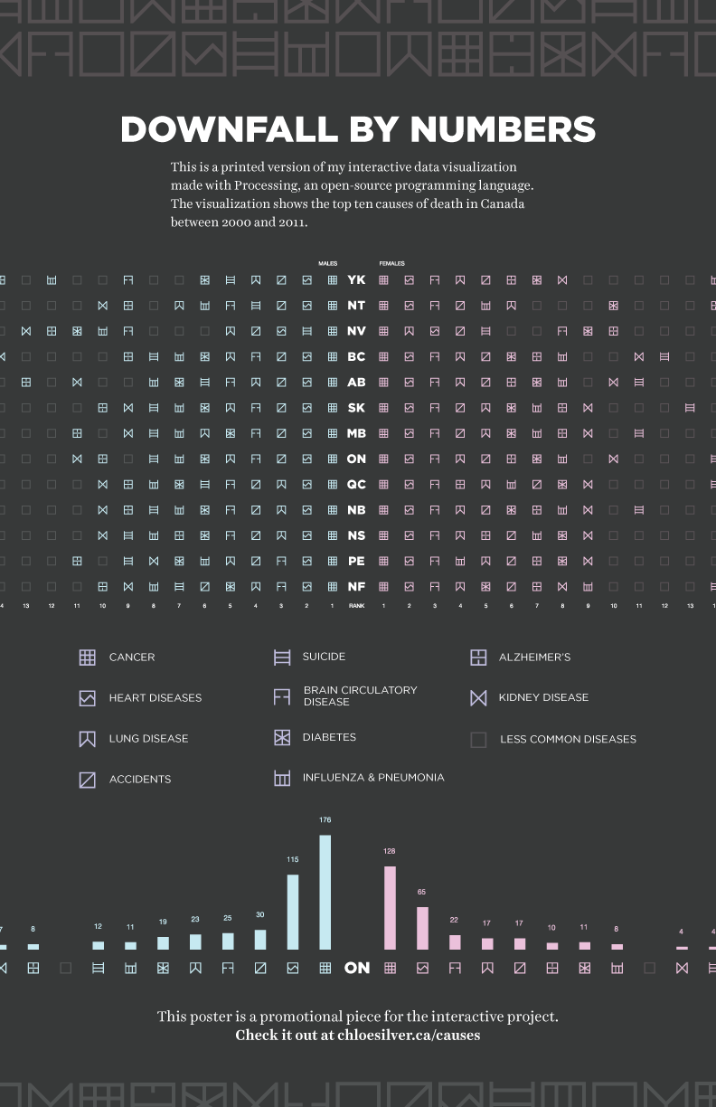
At the beginning of this project, I had a goal in mind of making generative art through the outcomes produced in an interactive data visualization. I looked through a multitude of sources for open datasets, and settled eventually on Statistics Canada’s dataset on causes of death in Canada.

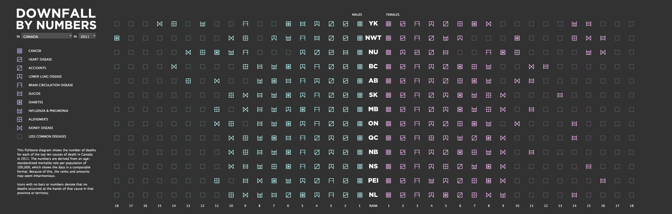
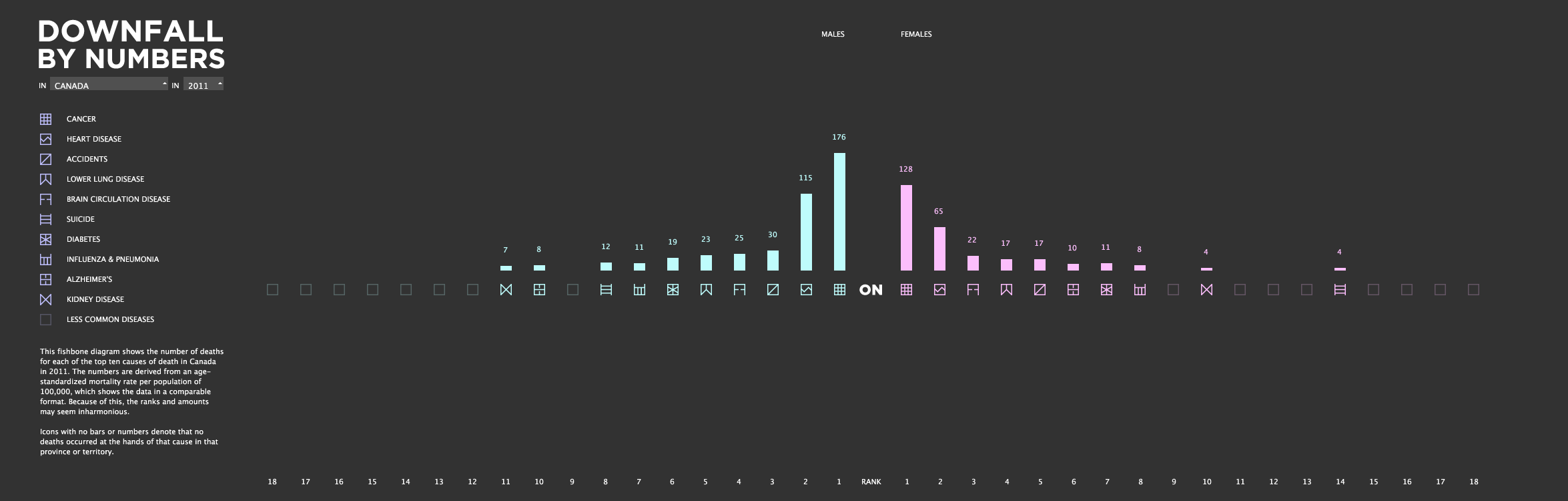
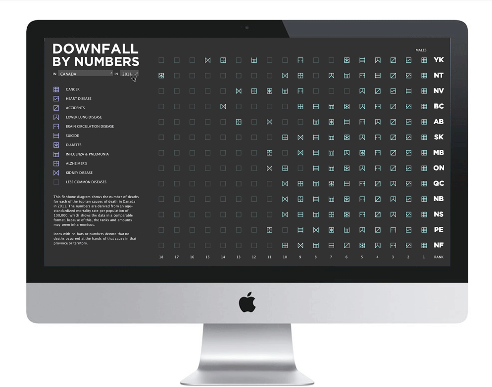
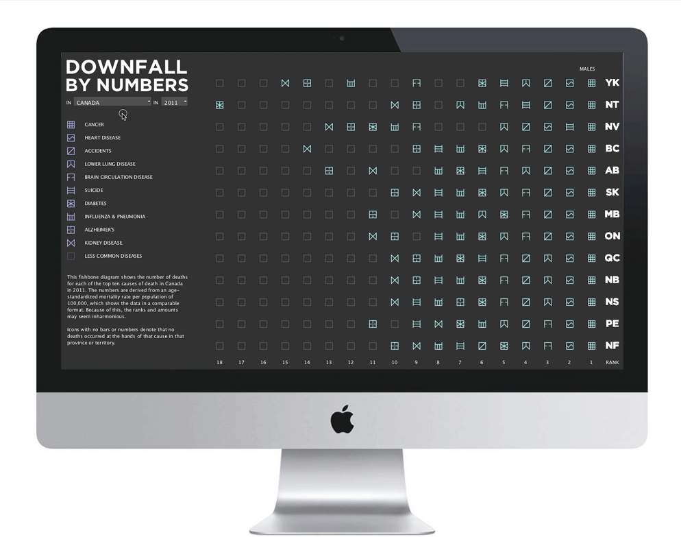
The mourning process is a difficult thing for humans to face, and I wanted to create a visual analytic tool that would bring some meaning or sense to the death of people’s loved ones. Some people enjoy statistics, which show them that they are not alone in their suffering. Others enjoy knowing that the death of their loved ones will affect others as well as themselves, and would appreciate seeing a visual representation of the deaths shown in a more pleasant subject matter. From these ideas, I decided to create a visual analytic tool that both displays statistics and generates a pattern based on the province and year in which a person passed away. It may seem grim, but I would hope that those suffering from loss would find some solace in the data and patterns created by the tool.

The goal of the project is to to ease the process of grieving by providing both statistics and creating something beautiful out of sad subject matter.


The full piece


When a specific province is selected.


Viewers can choose to view the country's rankings as a whole, or view more information for a specific province. They can also select a year between 2000 and 2011.


Selecting a year


Selecting a province


Hover over the legend to compare a cause throughout the provinces.


Each of the ten causes of death required a small icon or glyph to represent the way it causes destruction. I conducted some research into the visual ways that these causes manifest themselves in order to create a true representation in icon format. I went through many iterations of these glyphs, ensuring that they were different enough from each other, yet still felt like they were part of the same language as each other. Also, I was careful not to invoke symbolism that was unrelated to the causes.


I also created a promotional poster to further explain the visualization.


Check out the application, hosted at openprocessing.org:


WEBSITE


< FriendCanoe Cutural Networks >

Chloe's face

Designer, drummer, maker, shower singer

Chloe is currently working as a product designer in Toronto. In her spare time she enjoys designing data visualizations, interactive Arduino experiences, and writing on her blog.

You can find Chloe at [email protected], drumming in her Brazilian batu drumming band, at a number of local music concerts, or cycling around the city.

This website and all content therein is intellectual property belonging to Chloe Silver 2012-2023.